Wednesday, 19 February 2014

Evaluation Questions


1) In what ways does your media product use, develop or challenge forms and conventions of real media products?

http://prezi.com/_ncovork9irg/?utm_campaign=share&utm_medium=copy

2) How does your media product represent particular social groups?

http://prezi.com/_ncovork9irg/?utm_campaign=share&utm_medium=copy

3) What kind of media institutions might distribute your media product and why?


4) Who would be the audience for your media product?


5) How did you attracts/address your audience?


6) What have you learnt about technologies from the process of constructing this product? 


7) Looking back at your preliminary task, what do you feel you have learnt in the progression from it to the final product?


Monday, 10 February 2014

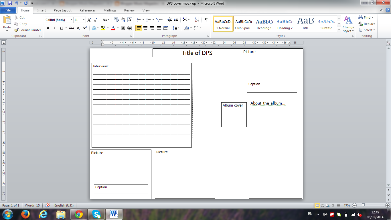
Writing copy for DPS


After the current release of her newalbum, Frances Hammond- a new found talent let us interview her in her private studio, trying to find out more about this femme fatale...

WHAT AREYOU EXPECTINE FROM 2014?
“Well my fans have been amazing so far and so supportive, I wouldn’t be here without them. I’ve got loads of concerts and festivals lined up too, 2K14 is gunna rock!”

WHO ARE YOUR ROLE MODELS, MUSIC WISE? “Well to be honest there are too many to say because I take inspiration from all types of music and try and input them into the music that I like to make and produce. It’s probably because I’ve been brought up on a range of music so I respect all of them, but obviously metal is the closest to my heart.”

IF YOU COULD BE SOMEONE FOR A DAY, WHO WOULD IT BE?

“I’ve never actually thought about that but if I had to pick someone it would be Dita Von Teese. She’s beautiful and amazing, I used to have posters of he up in my room when I was about 16 and I had always wanted to grow up to be like her. Plus she married Marylin Manson, who is one of my role models and is also a legend!”

WHAT’S YOUR MOST MEMORABLE MUSIC MOMENT?
“Being born and breed in Reading, like many other kids my first proper music experience was the Reading and Leeds summer festival. For me it was 2002, Foo Fighters were headlining and I somehow managed to get backstage and meet the band- I had a massive obsession about Dave Grohl so meeting his was like meeting God! It all just felt so surreal!”

WHAT WAS YOUR INSPERATION BEHIND YOUR NEW ALBUM ‘FROSTBITE’?
“Half of the songs on there are pretty old, I had a load of unfinished songs that I had written in the past and after I finished them they sounded better than I expected them to. They gave a new vibe but didn’t stray far away from how I sounded which was perfect. After that I made new songs taking inspiration from the blues and giving it a new twist. I also experimented with screamo in this album and I’m getting a good response from that so you might see more of that in my other albums”

DO YOU HAVE A FAVOURITE VENUE THAT YOU LIKE PLAYING AT?
“There hasn’t been a place that I found to be particularly boring or bad, but the scene in London is always amazing and that’s very important because the energy of the crowd just makes you want to give it your all and it’s such an amazing atmosphere. I would absolutely love to play at the Reading and Leeds festival because it’s my home turf and from being in the crowds to performing onstage is such a big step and achievement!”


Thursday, 6 February 2014

Draft designs

Front Cover draft designs


Contents Page draft designs 


Double Page Spread draft designs


Reader profile for Metal Wave


Reader Profile 


Average age- 21
Aimed at 16-25 year olds 
I want this magazine to be aimed at both men and women 
Interests- Music, Films, Gaming, Technology, Politics. 
Heavy Rock/Metal fans that enjoy going to gigs, concerts and festivals.   

Monday, 6 January 2014

Colour Testing


Red is energizing and a warm, positive colour. It can be associated as both  masculine and feminine colour because it is strong and powerful but also re symbolises love and passion. 
This colour is used in most Rock/Metal magazines. This may be because it is attention grabbing and stands out. it is a primary colour too so it becomes simple.

The colour orange radiates warmth and happiness, combining the physical energy and stimulation of red with the cheerfulness of yellow. Orange isn't used a lot in the magazine industry, this may be because not many colours may complement or contrast with it. It may fit in with a pop or R&B magazine. 

Being the lightest hue of the spectrum, the colour psychology of yellow is uplifting and illuminating, happiness, cheerfulness and fun. Yellow is used in some music magazines, for example Kerrang!  

Green in a balanced colour, symbolising growth and energy. It is a good colour to be used on a music magazine for example, rock and rap 

Blue is also a colour that represents balance. It could be used in music magazines but it is not regularly used. This may be because it may not stand out as well as other colours.

Purple, depending on what shade is used can either be very girly or unisex. It can also be associated with most music genres which is why it would be suitable to use on music magazines.

Pink is manly regarded as a feminine colour. Especially used for young girls, this could be why it is not used often in music magazines. Although it would fit in with a pop magazine 

The colour white is used a lot in music magazines, mainly used as a background colour to put pictures and text on top of. It is good because it can go with most colours and make them stand out more. It doesn't associate itself with any particular genre which is good because it can be used for all genres   

The colour black is versatile and can go with anything, like white. This could be why it is used in almost every music magazine. 

Font Testing for Rock magazine 'Metal Wave'

1) Metal Wave- Century Gothic

This font is clear and easy to read. But I think it lacks the edginess and roughness needed in the masthead of a rock and metal magazine. Its is too simple and rounded. It could however be the text in articles because it is easy to read.  

2) Metal wave- Algerian

This font is big and readable, it also is in all capitals which is good for a masthead. I don't however  like the gaps within the letters, it makes the writing not look strong and solid. Therefore I will not be using this font in my magazine. 

3) Metal Wave- Blackoak Std

This font is good is good because if its boldness and size, but it is stretched out which is an effect i don't like. Also even though it is easily read, it is too simple. It could however be used as a heading for one of the articles within 'Metal Wave', but not the masthead. 

4) Metal wave- Carbon black

I find this font inconsistent, with the 't' looking out of place, furthermore it looks too round to be a masthead for a Rock and Metal magazine. It might fit in with a Jazz magazine though. It is good because it is bold but I will not be using this for my masthead.  

5) Metal wave- Charlemagne Std

I really like this font, it is straight and strong. Also I think it fits in with the Rock and Metal genre. It is simple and readable but doesn't look childish or overcomplicated. I am going to be using this font for the masthead on my Rock and Metal magazine. 

6) Metal Wave- Copperplate Gothic Bold

I like this font too because it is strong and bold, although this font is consistent with its lie thickness, i like no.5 because itd line thickness varies which adds complexity and interest. I would however use this font in other headings of other articles because it would fit in. 

7) Metal Wave- Bella Donna
This font would not fit in with this magazine. It is too small and thin, also it isn't very easy to read. It might however fit into a Classical music magazine but not a Rock and Metal magazine
8) Metal Wave- Earwig Factory

This font had mush more of a punk vibe, which could be used within the magazine on a punk article maybe but it couldn't represent the magazine on a whole. 


9) Metal wave- Jokerman 

I think this font is too childish and playful to be included in this magazine. 


Case Study for Kerrang!


Background and Ownership

Bower Media Group - Publisher Weekly
James Mcmahon -Current Editor  
First Published- 6th June 1981 Geoff Barton (Founder and Editor) 
Sold for £2.20 in music shops and supermarkets


Content and Approach to Music

Kerrang! is a Rock music magazine that is written with the reader in mind, it uses colloquial language. This makes it more accessible and friendly, therefore opening up to more people. 

Reader Profile 
Average age- 22
Aimed at 17-24 year olds 
Overall it is bought by more males than females but that is quickly changing as more women are buying it. 
Interests- Music, Films, Gaming, Technology, Politics. 
Heavy Rock fans that enjoy going to gigs, concerts and festivals.   

Editorial content

The editorial section of this magazine follows the same tone of the rest of Kerrang! James Mcmahon keeps his section light and playful and casual, connecting to the readers. He also advertises certain features of the magazine, festivals, and also makes a reference to the Kerrang! website. 


Analysis of Double page spread


In this double page spread, there is one main picture and it dominates more than half of the top of the spread. The title is placed on the top right hand side and is written around the person. It is also written in quite an urban font, suggesting the genre of the music. It has a lights theme running through it with the fairy lights and the heading- "Twinkle twinkle little stars".  The band are central in the DPS i think this is effective and I like the fact that there is something to the left and right of them. There is also a smaller picture in the middle of the writing at the bottom. This adds interest to the writing.

Promoting the industry and other products

Kerrang! magazine promotes and advertises a lot of different things for example festivals, concerts, clothing, and most of all bands and artists.