Monday, 2 December 2013
Kerrang! Contents page analysis
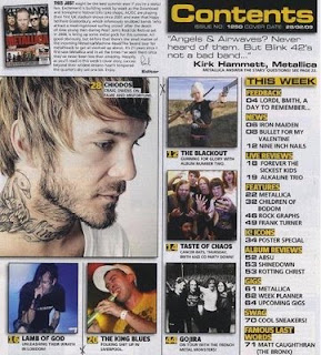
This contents is taken from the Kerrang magazine which i analysed for the front cover, This isn't from the same issue but i find it useful to analyse one from the same brand of magazine because they will be in the same guide lines for all magazines.
Layout: The layout consists of multiple pictures, one bigger than the rest- this could indicate that this is related to the main focus/article of the magazine. Every picture had a short description which is good because then it is makes the photo relevant. On the left is the contents page, this is more brief. it splits the pages into sub sections which i think it is good because it allows the reader to go to a specific section which they have interest in for example 'gigs'. The colour theme has carried on mostly from the front cover, but the red isn't as prominent. This could be a flaw in the design.
Subscribe to:
Post Comments (Atom)

No comments:
Post a Comment